The Honest Company

Homepage Optimization

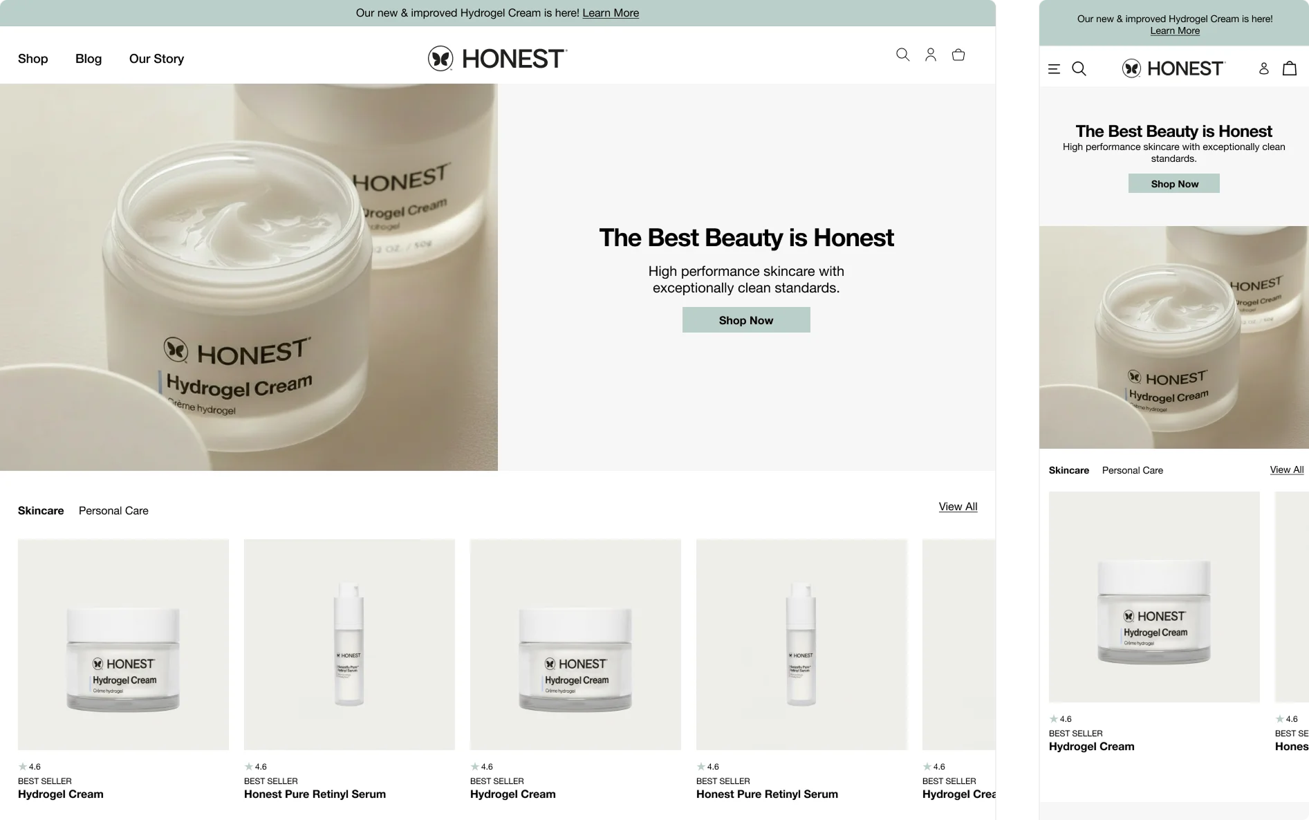
Homepage optimization desktop and mobile views

Approach

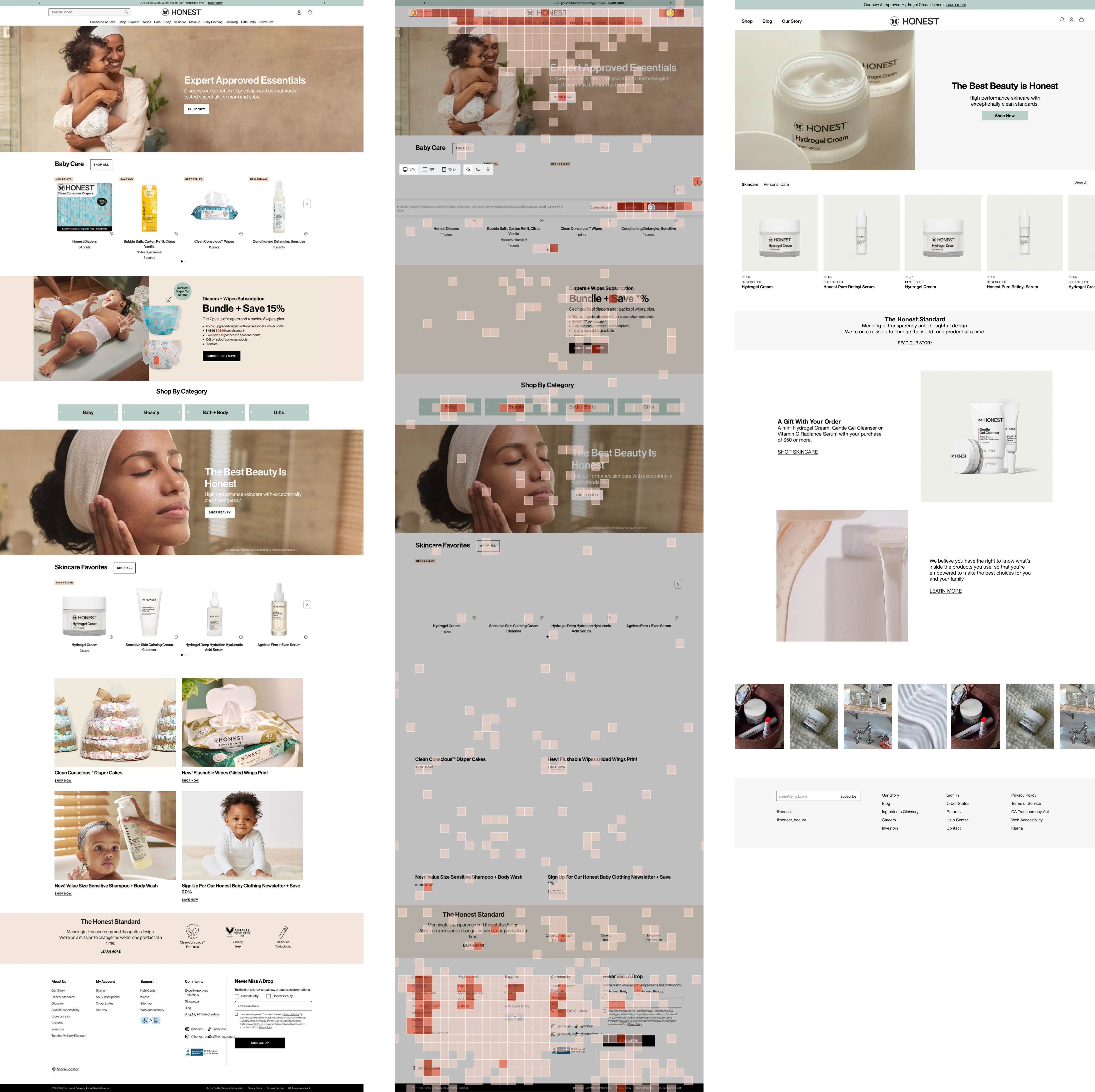
The analysis used heatmap data and session recordings to understand user behavior patterns on the homepage and identify why visitors were leaving so quickly.

What the Data Showed

Navigation & Product Discovery

The problem: Users landed on the homepage and bounced almost immediately. Click patterns revealed they couldn't easily find the product categories they were looking for.

Why this mattered: Visitors arrived with intent but couldn't get where they needed to go. The navigation structure wasn't intuitive enough, causing potential customers to leave before they even started shopping.

Brand Differentiation Getting Lost

The problem: The clean ingredient standards and brand mission—the things customers actually cared about—were buried on the page. Users weren't seeing what made the brand special.

Why this mattered: These were the key differentiators and the reason people chose this brand over competitors. By not featuring them prominently, the site was missing critical opportunities to build trust and emotional connection during that crucial first impression. The biggest selling points were essentially hidden.

Too Much Going On

The problem: The homepage was trying to do everything at once. Instead of guiding users toward products they'd love, it was overwhelming them with choices and information.

Why this mattered: Session recordings showed this clearly—users would scroll down, pause, scroll some more, then leave. This was classic decision paralysis. The page was creating cognitive overload instead of making it easy for people to discover products and take action. It needed to guide, not overwhelm.

Recommendations

Highest priority:

  • Simplify the navigation so users can actually find product categories without hunting
  • Feature ingredient standards and mission prominently—make them impossible to miss

Important next steps:

  • Reduce the amount of competing information on the page. Less is more here.
  • Create clear, focused calls-to-action that guide users down specific pathways rather than presenting every option at once

Before & After

Homepage optimization before and after comparison

Implementation Approach

Design & Stakeholder Alignment

Based on the user behavior data from the audit, mockups were created in Figma to address the identified issues. The design prioritizes simplified navigation, elevated brand differentiators, and reduced cognitive load through clearer content hierarchy.

A key component of the solution is personalization. Rather than showing every user the same overwhelming homepage, the approach tailors content based on entry channel. For example, users arriving through beauty-focused channels would see beauty content front and center as they enter the site. This will reduce decision paralysis by presenting relevant products immediately, rather than forcing users to filter through categories that don't match their intent.

The next step is to present the mockups to key stakeholders with supporting data from the heatmaps and session recordings. This approach will help connect the design decisions directly to observed user pain points, making it easier to secure buy-in and alignment across teams.

Engineering Handoff

Once the designs are approved, detailed requirements should be documented to translate the UX improvements into actionable development work. JIRA tickets should be created for the engineering team, breaking down the homepage updates into specific, implementable tasks with clear acceptance criteria and priority levels.

This structured handoff will ensure the engineering team has everything needed to execute the changes while maintaining the intent behind each design decision.